Financial Services Websites
Structuring multi-service financial websites so users can understand services faster, trust the brand more easily, and recognise the right next step.
Overview
This case study covers two corporate websites in the financial and investment space: charisma.ir and tamadonib.com. In both cases, the work focused on making service-heavy financial brands easier to understand, more trustworthy, and less confusing for users who needed to identify the right service or next step.
Context
These were not simple brochure sites. Both brands operated in sensitive financial contexts where trust, service clarity, and information order directly affected how users perceived the company. The websites needed to communicate multiple financial services without overwhelming visitors or blurring the difference between offers.
The problem
The challenge was to reduce user confusion while presenting a broad set of financial services. If the structure, wording, and interface hierarchy were not clear enough, users could easily lose confidence, misunderstand the available offers, or fail to identify the service path that matched their needs.
Role
Atena contributed to information structure, service clarity, UI refinement, and overall readability. Her role was to help shape websites that made complex financial services easier to understand, more credible, and less ambiguous for users.
What Atena contributed
- Improved page structure and the overall order of user-facing information
- Helped clarify how multiple services should be presented without overwhelming visitors
- Contributed directly to UI refinement, including typography, spacing, visual hierarchy, and readability
- Supported a more trust-building experience by reducing ambiguity and making service paths easier to follow
- Helped users understand which service or financial product was more relevant to their needs
- Worked across brand needs, content organization, and implementation realities to make the websites more coherent
What mattered in this work
Clear services, calmer structure, stronger trust
The goal was not to turn these websites into product platforms. It was to make multi-service financial brands easier to understand, easier to trust, and easier to act on.
Scope note
Within Tamadon, venture-capital context existed in the broader environment, but it is not the main focus of this case study. The emphasis stays on the main financial-services websites rather than on every sub-brand or product line the companies operated over time.
Selected screens
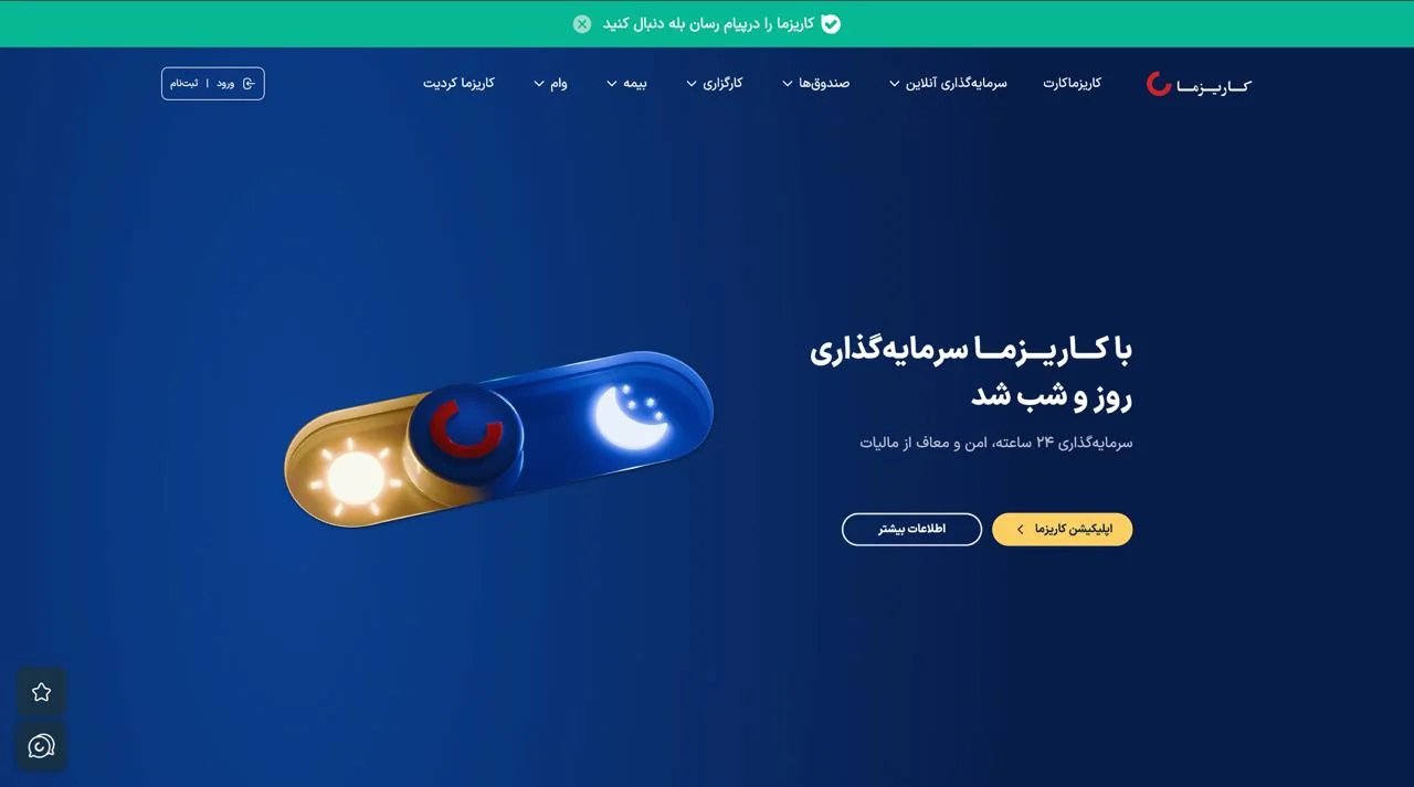
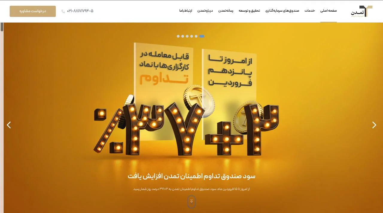
Two financial brands, two different trust signals
These public captures show the websites as users would encounter them: one presenting a broad financial-services ecosystem, the other framing a more formal investment-banking brand experience.
Outcome
The result was a clearer and more trust-oriented web experience for financial brands with broad service offers. The websites became better at explaining what the companies did, reducing confusion, and presenting services in a more readable and credible way.
Reflection
In financial-service websites, visual polish alone is not enough. Users need to understand the structure quickly, trust what they see, and feel that the right next step is obvious rather than hidden behind crowded information. Here too, the real work was turning complexity into clarity.