Parhantech
Turning a vague commercial brief into a clearer, more executable, brand-aligned website direction.
Overview
Parhantech was not a simple redesign of a mature website. It was a greenfield commercial web project where the brief was still raw, the client did not yet have a clear site direction, and the work had to move from ambiguity toward a structured, usable, and visually coherent outcome.
Context
The challenge was bigger than building pages. The site needed to communicate what the business offered, help users understand where to start, and create a more credible digital presence. At the same time, the visual tone had to align with the parent holding’s black-and-gold brand language without becoming heavy or confusing.
The problem
At the start, the client’s request was essentially: “build us a website.” There was no strong existing information structure, no sufficiently defined brief, and no clear decision on what users needed to understand first. The project needed prioritisation, direction, and a clearer visual and content hierarchy before execution could become effective.
Role
Atena worked at the intersection of raw client needs, UX structure, and interface direction. She helped turn an undefined request into a more buildable website scope, contributed to page structure and UI clarity, and influenced brand-aligned visual decisions including layout tone, color direction, and early logo exploration.
What Atena contributed
- Helped shape the initial website structure from a highly open and still-undefined brief
- Clarified key page priorities and the order in which users should understand content
- Improved UI quality through attention to typography, spacing, hierarchy, and readability
- Supported more reliable responsive behavior across desktop and mobile contexts
- Contributed to visual direction so the website felt more aligned with the parent holding’s brand tone and commercial positioning
- Helped move the project from a vague request toward a more coherent and executable scope
What mattered in this work
Turning a vague request into a clearer website direction
This case is strongest when framed around what it had to solve: an undefined brief, early brand direction, and the need to shape a commercially usable website from almost nothing.
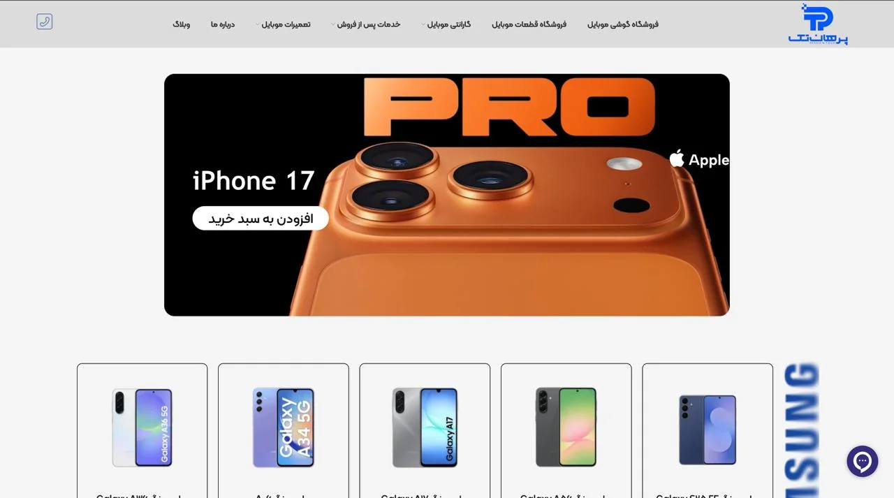
Selected screens
Commercial clarity across hero, catalog, and product entry points
These captures show the project as a working commercial website rather than a conceptual layout: high-visibility promotions, product discovery, and a denser catalog interface that still needed to stay readable.

Outcome
The project moved from a vague client request toward a clearer, more structured website direction. The resulting experience was more readable, more consistent, and easier to build against because the hierarchy and priorities were better defined.
Reflection
Parhantech shows that some projects do not begin with a clean brief — they begin with uncertainty. In those cases, strong UX work means turning ambiguity into structure, decisions, and a direction that others can actually build on.