Crowdfunding Platforms
Clarifying crowdfunding product structure, participation flows, and role logic across crowd.charisma.ir and ibcrowd.ir.
Overview
This case study brings together two crowdfunding-focused product experiences: crowd.charisma.ir and ibcrowd.ir. In both projects, the challenge was not only interface design. The bigger job was to define journeys, reduce ambiguity around roles and actions, and turn raw business intent into material that development could work from.
Context
These products sat in the crowdfunding and investor-participation space, where platform clarity matters as much as interface quality. Multiple roles, trust signals, funding steps, request stages, and decision-sensitive actions had to be made understandable for both applicants and investors.
The problem
At the start, the products were still raw. Core journeys, role logic, panel structure, and request-related flows were not yet clearly defined. The challenge was to move from scattered business intent toward a product structure that stakeholders could discuss, users could understand, and developers could actually build.
Role
Product & UX Consultant (project role). Atena worked between business goals, product logic, and technical execution. She helped define how the crowdfunding experience should work across users, roles, flows, forms, panels, and platform structure, while also contributing to interface clarity and visual refinement where usability needed support.
What Atena contributed
- Defined product structure and key user journeys for crowdfunding-related experiences
- Clarified applicant and investor flows across the platform
- Structured requirements for roles, panels, forms, and core actions
- Prepared implementation-oriented materials using Figma, XMind, and Balsamiq Mockups
- Conducted usability reviews and iterative feedback to identify friction and improve clarity
- Contributed to visual direction and UI refinement, including typography, spacing, hierarchy, and interface clarity
- Helped move both products from raw business intent toward a more defined, discussable, and buildable product scope
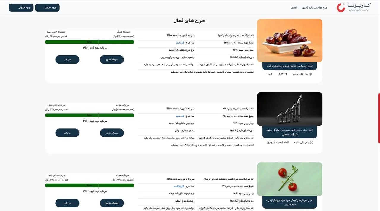
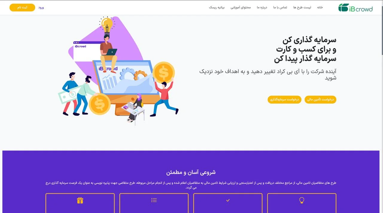
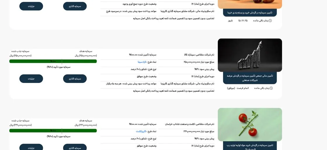
Selected screens
Public-facing evidence from the two crowdfunding products
These captures keep the case grounded in the actual platforms while the private requirements and flow files stay outside the public portfolio.

Outcome
The main outcome was a clearer product foundation, not just cleaner screens. Roles became more explicit, key journeys were easier to follow, and the development team had a more structured picture of what needed to be built next.
Reflection
This work reinforced an important product and UX lesson: in financial platforms, the hardest part is often not the final screen, but turning ambiguity into structure. In crowdfunding experiences, users move through trust, risk, eligibility, and decision-making. Good UX starts by making that logic clear before polish comes later.